On December 7th 2023 The Climate Change Institute added the following announcement on its Reanalyzer webpage section about Data Source and Information (It was only up for two days!):
CFS is a numerical climate/weather modeling framework that ingests surface, radiosonde, and satellite observations to estimate the state of the atmosphere through time. These visualizations allow users to explore weather-driven temperature changes within specific years, while also having several decades of daily data for broader climate context. This content is intended for general analysis only. Any apparent record high or low daily temperatures estimated by the Climate Forecast System should be considered with caution and validated against weather station observations and other climate data products. CFS exhibits a winter warm bias over portions of the Antarctic
If you like the research I have been doing and the Expose, Please Donate!
How the above Update came to be, read the Story below!
On Dec 09 2023 the Statement above was replaced by this:
Please Note: This content is intended for general analysis only. Any apparent record high or low daily temperatures estimated by ERA5 should be considered with caution and validated against weather station observations and other climate data products. Regarding high global mean temperatures in July 2023, Copernicus C3S and the World Meteorological Organization issued this statement. The NOAA National Centers for Environmental Information (NCEI) made a similar assessment.

Expose - Part # 1 of 3
Open Letter to the Climate Change Institute
Who is this Climate Institute, some may wonder, why is this even relevant, what do we need an "Open Letter" for?
All the Climate scare articles, all summer long, as well as the Heat Records proclaimed are based on the "Authority" of the University of Maine's Climate Change Institute as exemplified by this New York Times Story:
But by what "Authority" do they really speak? What is the basis, what is the Data that this "Authority" is based on, one might ask, if one was curious?
That is what this story is all about.
On August 27th I saw that there was an Extreme Cold Weather Event unfolding on the Antarctic Continent based on data from the University of Maine's Climate Change Institute's Reanalyzer Tool . Based on that Data, on August 30th ,I sent a long email to the Climate Change Insititute from the University of Maine with this concluding question:
"So really, is any of what I see on the Graph on the Climate Re-Analyzer Website below actually based on real on the ground Temperature Readings on Antarctica? If so, which stations are you using and including to come up with that Daily Average on the Graph of -30.72 C for August 29, 2023?
I never did get a response to that email!
This is what I saw form the Data at the Climate Change Institute based on the NOAA "Model":
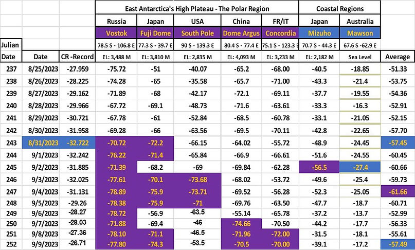
The table for 09/01 => 09/04 - The Labor Day weekend 2023 (very Cold Forecast based on NOAA Data!):
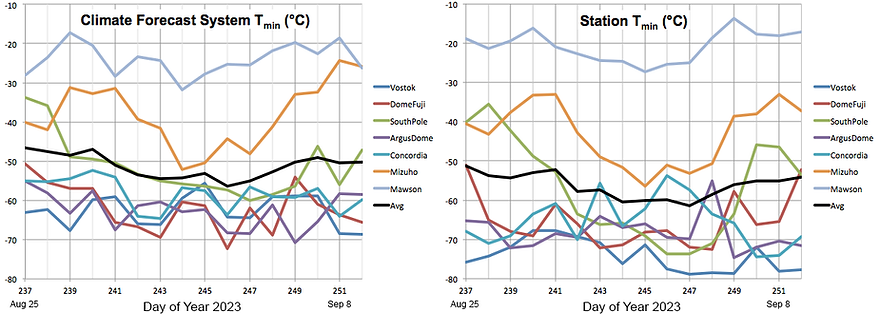
This is what the Climate Change Institiute put out based on the same data from the same NOAA Data Model as the Table above (Notice the sharp 'Warming" trend after August 31st for the next 10 days?);
From the Data gathered from the Reanalyzer Tool, on or about August 27th , I saw in that 10-Day forecast that Labor Day 2023 was going to get Extremely Cold on Antarctica, like maybe All-Time Record Cold. I built a Model of 20-Stations/Locations Geographically dispersed throughout that vast Continent and logged in the Data that the Climate Change Institute had provided to me via their Reanalyser Tool, and this is what Came out of that experiment.
The Forecast for September the 4th from The Reanalyzer Tool, based on NOAA's own Data Model. looked like we would have an All-Time Cold Record of - 39.80 C, beating the August 10, 2010 Record (-38.06 C) by almost 2 C Colder!
When the dust settled after I concluded all the Data gathering for the Labor Day weekend 2023, that NOAA prediction turned out to be actually very close to what happened for September the 4th, 2023 from mostly the individual Weather Stations Data themselves. The Final Temperature turned out to be - 40.10 C. Only 0.30 C off and Colder than what was forecast:
The official Record for All-Time Cold for Antarctica has stood since August 10, 2010, at -38.06 C
This Extreme Cold Event on Labor Day 2023 looks like it broke that record by 2 C. but you would not know that as the Climate Change institute initiated a Warming Event out of thin air, without any evidence or data to back it up and made Antarctica about 6 C Warmer as of August 31st over the next 9 days while on the ground on over 90% on All of Antarctica it became brutally Cold.
As I mentioned before, on August 30th, I wrote a long email to the Climate Change Institute People, based on what I had observed that was coming soon, and asked that questions, the one I started out with:
"So really, is any of what I see on the Graph on the Climate Re-Analyzer Web-Site below actually based on real on the ground Temperature Readings on Antarctica? If so, which stations are you using and including to come up with that Daily Average on the Graph of -30.72 C for August 29, 2023?
This is what I saw happening that Labor Day weekend of 2023:
Here is that Data again, in more detail this time for the Labor Day 2023 Extreme Cold Weather Event:
The Climate Change Institute Reanalyzer Data is in the furthest left Column under the Heading CR-Record
CR-Record the -32.722 C
Peak Low in the Right Most Columns is on September 4th , 2023, not August 31st (The left most column is the Climate Change Institute Data) ! And the Extreme Cold keeps going to at least September 9th , if not longer.
This is how the Climate Change Institute reported that very same Labor Day Weekend event on their Reanalyzer Graph
(Notice the sharp "Warmer" reversal on August 31st and the Temperatures going straight up for about ten days?):
he Discrepancy is quite striking, how could this be, how is this possible, it is like two different Worlds, two different Realities? The CCI Warming Antarctica from -32.7 C on Aug 31st to -26.7 C on September the 9th, a full 6 Degrees of warming, while the High Plateau and 90 % of Antarctica became and Stayed Brutally Cold till 09/09/23 according to the Observational Data on the ground
On the evening of Monday, September the 4th, (Labor Day here in the US), after having saved off all the Data for that weekend, I finally decided to read an Article I had seen in the months before, by an Australian Scientist about Antarctica and it being "Warm". I had saved off the URL somewhere on one of the Excel spreadsheets and finally managed to locate it:
Much has been written in the tabloids, and repeated by the fashionable, about it being very hot through June – even in Antarctica. Really, I wondered. Is Antarctica melting? The Australian Bureau of…
Warming in Antarctica? | The Spectator Australia
I could not believe what I was reading. This Scientist had written a story about "Warming" on Antarctica and the Climate Change Institute's role in that "Warming", that I had just witnessed up close and personal. I had to find her email address and tell her what I had found. It totally aligned with her descriptions:
"Some of these claims have their origin in the University of Maine’s Climate Reanalyzer, a tool that uses satellite data and computer simulations. So, they represent a remodelled average. Indeed, there is not a single place where anyone, can measure the average temperature of the Earth – or Antarctica. Rather, when it is announced that it is the hottest it has ever been, reference is made to a statistic."
Dr. Jennifer Marohasy's Blog: Blog - Jennifer Marohasy
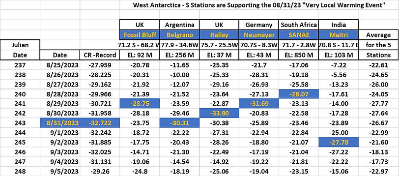
There had to be some reasonable explanation though for the abrupt reversal on that Antarctica Graph for August 31st? So I went looking for it, and scoured through the reams of Data I had saved off over the Labor Day Weekend, and this is what I found. 5 stations on a limited stretch of Coastline had a Peak Cold one to three days prior to August 31st.
All these 5 Stations are located on a 1,100 Mile Strip of Coastline (out of 11,500 Miles of Total Antarctica Coastline):
So, it appears that the Climate Change Institute is basing their Daily Graph values on about 10% of the total territory of the Antarctic Continent, at least that is what it looked like for the Labor Day Weekend of 2023.
Ten days after the Labor Day Weekend, Dr Marohasy responded to my attempt to reach her and me sharing my experience. She recognized what I had tried to tell her as important. We have been talking since and she has kind of become my Mentor.
Encouraged by Dr. Marohasy's support I reached out to the Climate Change Institue and confronted/challenged them with my Data. But having gotten no response to my first email from August 30th , I went to the office of the President of the University of Maine to see if I could not get someone there to listen to me. To my surprise the person I reached out to, Mr. Jason Charland forwarded my email to the person in charge at the Climate Chane Institute, a Professor Sean Birkel, and within two minutes I got a response from him, Wow!
Hesitantly at first , but to their Credit they did listen to what I had to say and finally acknowledged, that Yes, there was a Bias in their Model and No, they were not focused on Observational Data and Yes, they would make changes to align better with the Colder Observational Data I had provided them from the maybe All-Time Record Cold Weather Event on Antarctica during the Labor Day 2023 weekend.
In an email from October 5th 2023 Professor Birkel included this Graph, he plotted out the difference between the NOAA forecast (Table on the Left) for the Labor Day weekend of 2023 and my Observational Temperatures from the actual Stations themselves, that I sent to him (Table on the Right):
Julian Day 247 (Day of the Year 2023) on the Horizontal Axis, is September 4th ,2023, in these Graphs.
The South Pole Observation Data is 14 C Colder than the NOAA Model Forecast
The Vostok Observation Data is 14 C Colder than the NOAA Model Forecast
The Average is about 5-6 C Colder than the NOAA Model Forecast
On October 10th the Labels for all the Graphs were quietly changed from "OBS Temp" to AVG Temp", an acknowledgement of sorts that not much in this entire Record System is really based on much Observational Data as all. No announcement was made about that, but I look at that Graphs every day to see what the Day brings this time, and I did notice it!
On October 19th there was this Email Exchange:
From: Sean Birkel <............@...............>
Sent: Thursday, October 19, 2023 8:13 PM
To: Frits Buningh <............@.............>
Subject: Re: A Small Sets of Data Problem
Hi Frits,
Thank you for the interesting personal story - and I am sorry to learn of your hearing loss. My offer for a Zoom meeting was not to give a presentation, but to have a conversation in which we could clear up misunderstandings more easily than through e-mail.
The steep rise in temperature on the area-mean time series is indicative of a large-scale weather pattern shift. In the case of late Aug - late Sep, the westerly circulation shifted from zonal to increasingly meridional flow that brought warm-air incursions into the high latitudes. Here is a reanalysis animation of daily 2-meter air temp and anomaly September 1 - 21:
https://climatereanalyzer.org/gif/era5_arc-lea_t2_t2anom_sep-2023.gif
And here is another for 500hPa heights & standardized anomaly:
https://climatereanalyzer.org/gif/era5_arc-lea_gph500_gph500-anomsd_sep-2023.gif
Looks like the warmer air didn't reach the higher elevations of East Antarctica, including Vostok and Dome Fuji, until around September 12th. The table you sent has values up to September 9th in which those two sites in particular remain cold.
Nonetheless, the station data that you sent show well that the NCEP Climate Forecast System has warm bias over the Antarctic Ice Sheet. I've updated the chart and informational text on the daily temperature page to better emphasize that CFS values are estimates, and that detailed study should utilize station observations and other climate data products.
Beyond that, for the daily historical temperature page I am migrating away from CFS to ERA5 (European Reanalysis version 5), which is the latest-generation operational reanalysis that has much less bias over the Antarctic than CFS (e.g., Bracegirdle et al., 2012; Tetzener et al., 2019; Zhu et al. 2021). Should be posted next week, along with information about the change-over and a comparison of both CFS and ERA, plus publications for further reading. (NOTE: according to a 12/05/23 Email from Prof Birkel, this has not happened yet?)
All that said, I use station observations extensively in my own research in addition to model-based products such as reanalysis. There is great value in both. Using one or the other, or both, depends on the intended project or application.
Cheers,
Sean
---
Sean Birkel
Assistant Extension Professor
Maine State Climatologist
Climate Change Institute
Cooperative Extension
University of Maine==========================================================================================
So, if their Model has a "WARM" Bias, does that mean then, that none of the Records we have been told about this year are real? Those records, like July 6th being the Hottest Day in Human History Ever, are just maybe Estimates based on maybe faulty and "Warm" Biased Estimates from the Past,
=========================================================================================
After reading this email exchange, can you say that you still have confidence in the "Science" and that there is fool-proof evidence that the Climate Crisis is real, for the Data tells us so?
The NOAA Scientist actually do know too, that it is getting Colder in Antarctica, they write about it, but are just reluctant to come out and say that on National TV and to journalists, lest they offend them with their Facts:
"At the Amundsen-Scott Station at the South Pole—located in East Antarctica—temperatures have cooled in recent decades; a 2014 review paper in Polar Record suggested that the cooling trend could be due to fewer warm ocean air masses reaching the continent’s interior."
Antarctica is colder than the Arctic, but it’s still losing ice | NOAA Climate.gov
Today I am still asking the Climate Change Insititute from the University of Maine this same question, I first asked on August the 30th:
"So really, is any of what I see on the Graph on the Climate Re-Analyzer Website below actually based on real on the ground Temperature Readings on Antarctica? If so, which stations are you using and including to come up with that Daily Average on the Graph of -30.72 C for August 29, 2023?
There still is no answer, I have never been given any Stations' name that is/are included in their Model?
And by what "Authority" do they really speak?
From the Graphs comparing the Labor Day forecasts of the Seven Stations with the reality on the ground the answer is obvious: "No, that Authority is not based in Data, just Estimates. As to the question of the "Authority" that the NYT claims the Climate Change Institute possesses, the answer is probably that 97% of the Journalists will agree unquestionably with whatever Record(s) the Climate Change Institute is going to put out, because the NYT is the paper of Record and is the ultimate Authority of "Everything", a circular sort of reasoning that furthers the CAUSE of the Climate Crisis.
To the Climate Change Institute from the University of Maine I say this: Do the right thing, come back down to Earth, and make the reporting accurate from an observational perspective! It should convey useful and actionable information. It should not be some exercise in Esoteric Academic Climatological Posturing using Estimates.
In the Real World if a Model was 14 C off from reality, that Model would be cast aside. Start over and ditch that "Climatology Model". Built something new, based on Observations and make the Satellite Data augment what is the Reality on the ground, not the other way around, where you adjust reality, to make it fit your "Climatology Model" or the Satellite data or worse yet, the Gospel of Greta from Sweden.
I am certain that a Pilot coming in for landing at the NZSP South Pole Airbase would NOT appreciate being advised that the Temperature is 14 C "Warmer" than it actually is (But that is exactly what the Data from the Climate Change Institute has been reporting). It may make a difference in how that Pilot makes his landing approach; lives hang in the Balance in situations like this.
License and Citation
Climate Reanalyzer content is licensed under a Creative Commons Attribution 4.0 International License . Figures may be used as-is in publications, newsletters, and websites provided that the ClimateReanalyzer.org and data source labels are visible, or otherwise credited if image is modified.
To cite Climate Reanalyzer in a publication, please use this page-specific reference along with source dataset citation:
Birkel, S.D. 'Daily Surface Air Temperature', Climate Reanalyzer (https://ClimateReanalyzer.org), Climate Change Institute, University of Maine, USA. Accessed on [dates downloaded between 08/29/23 and 12/07/23].
Published December 07, 2023
This work is licensed under CC BY-NC-SA 4.0
Frits
Frits Buningh
Columbia, MD USA
PS. Anyone interested in the Data, I am not like Dr Michael Mann, from the U-Penn and the "Hocky Schtick" fame, I am willing to share all my data. Shoot me a "Connect" request at "linked In" and tell me what interests you and I will send it to you.


💪💪💪
This is quite the Story!